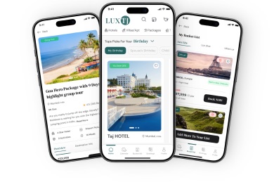
 Mobile app
Inspiration in the pocket
Discover destinations, save ideas and return when a trip becomes real.

I designed the first version of LUXTJ during my earlier freelance engagement. When people struggled to understand key features and complete important journeys, I owned that outcome and returned to lead the redesign. The work was about making complex travel decisions easier to understand, while working inside an evolving product system and delivery constraints.
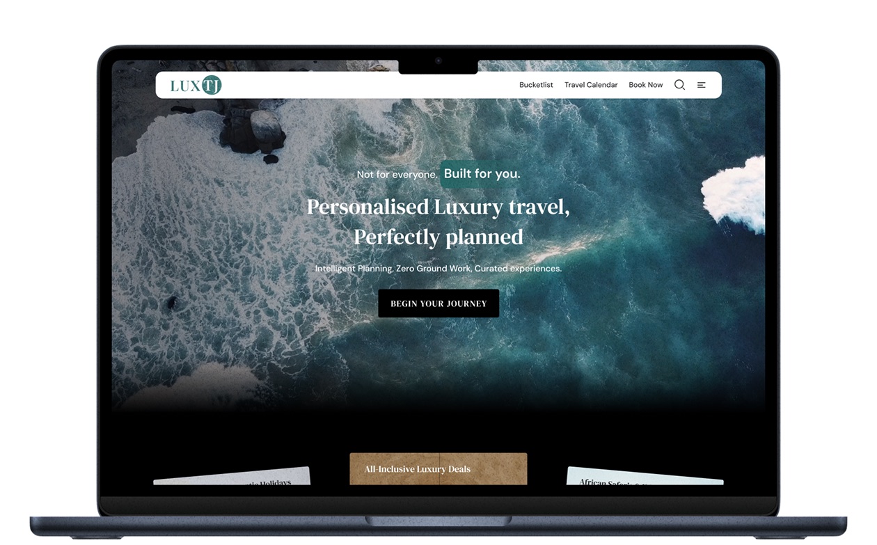
I designed v1, but it asked people to configure a Personal Travel Calendar, interpret dense checkout and navigate an unstructured profile before showing value.
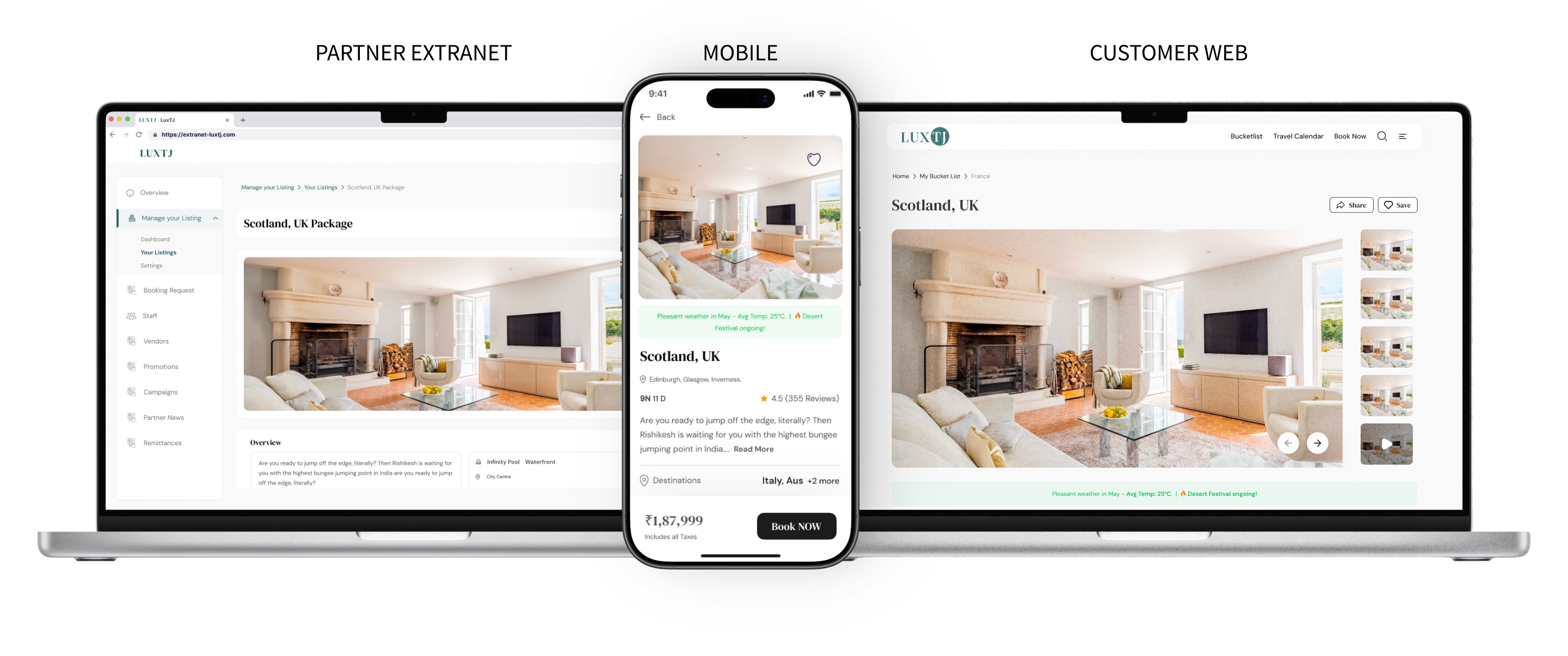
The redesign had to work across an evolving web, mobile and partner ecosystem. I kept the trip context, prices and policies connected without making each screen feel overloaded.
I framed the product questions, traced the friction, mapped journeys, set the hierarchy and worked through edge cases with the team through handoff.
People understood the Personal Travel Calendar in 30–50 sec, checkout completed 22% faster and profile engagement rose 70%.
Mobile appDiscover destinations, save ideas and return when a trip becomes real.
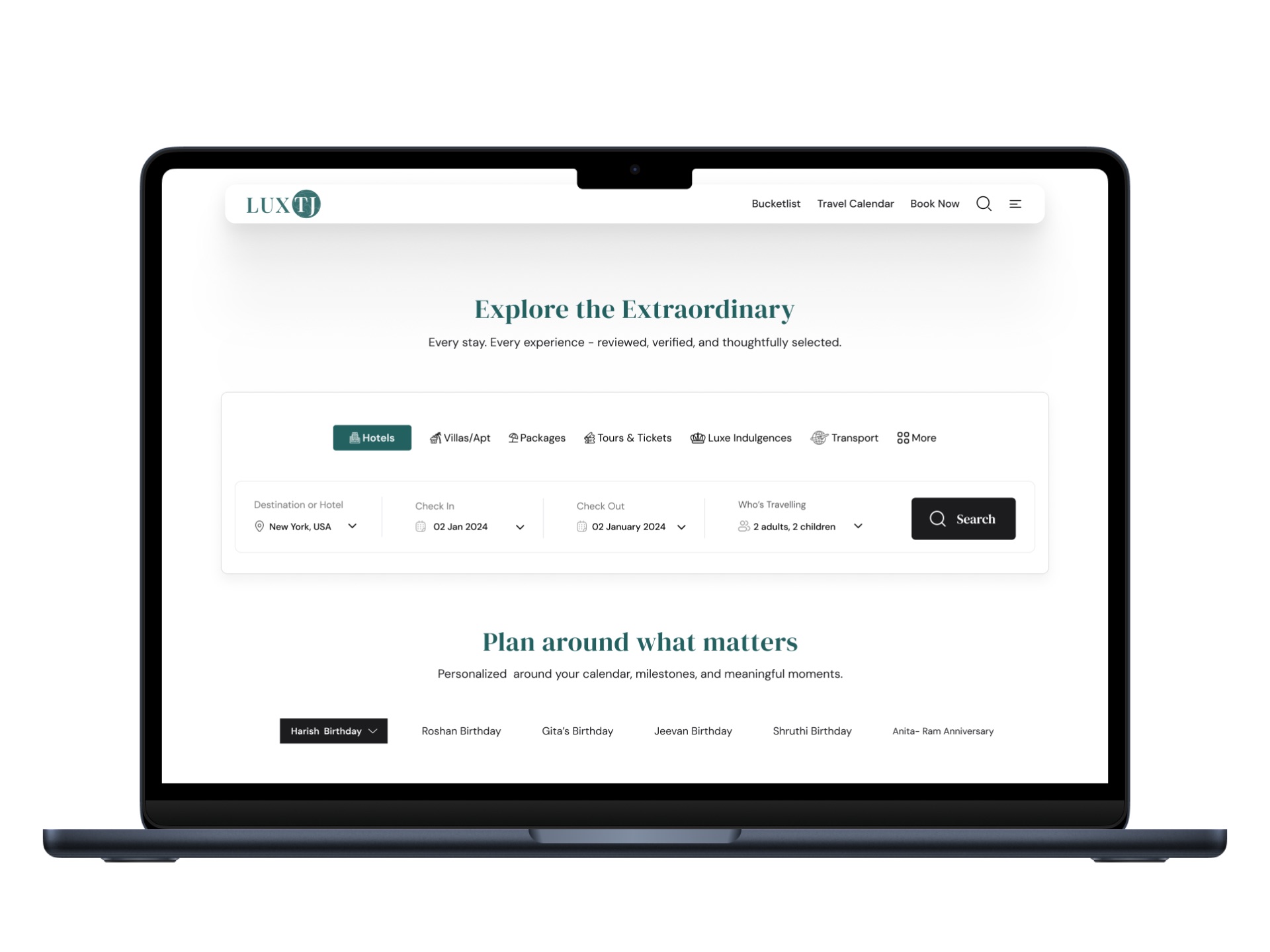 Customer website
Explore, evaluate and assemble a complex trip with more context.
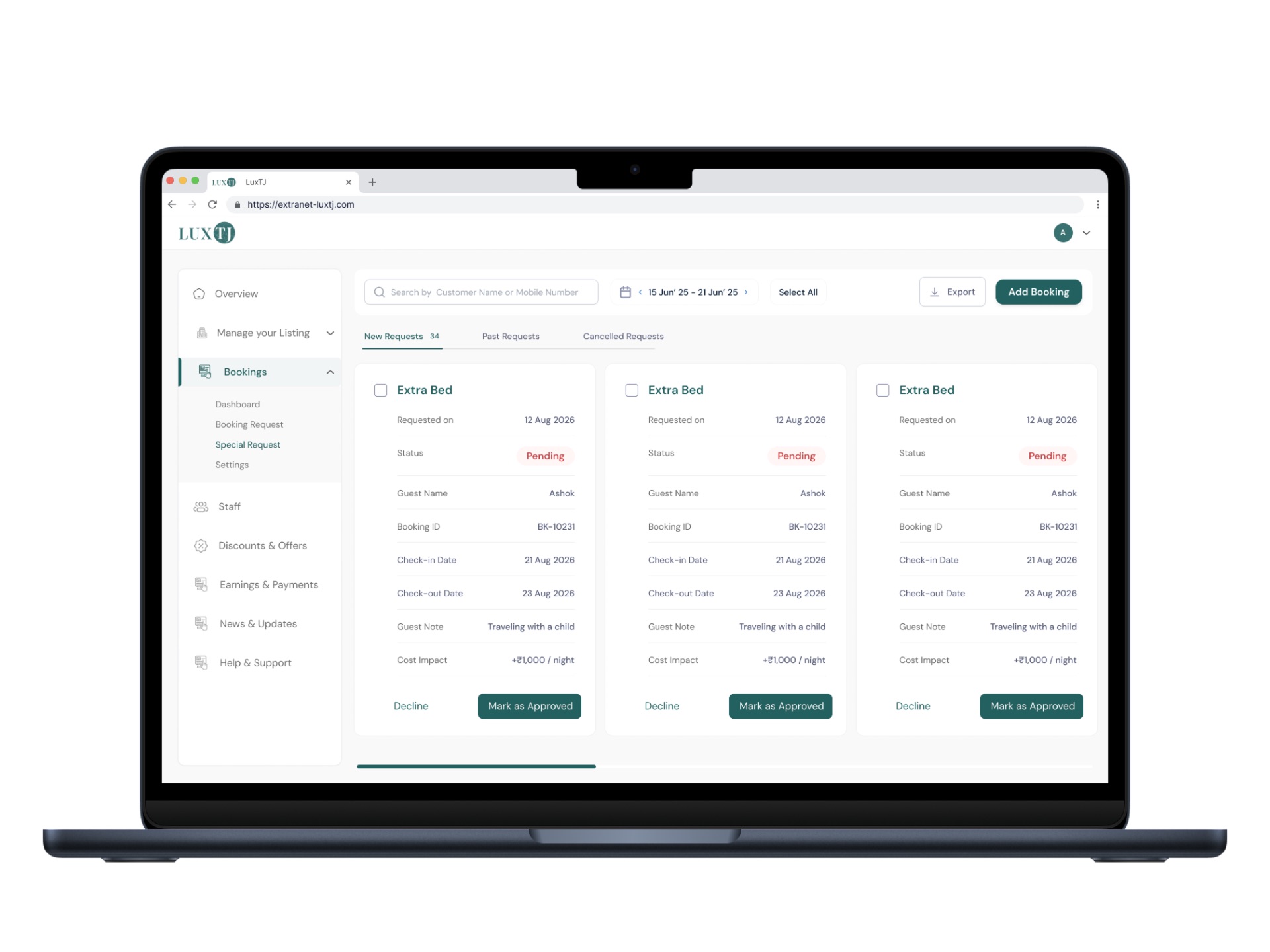 Partner extranet
Manage content, availability, pricing and bookings behind the customer experience.
During my first freelance engagement, I designed a product that tried to expose the richness of luxury travel immediately. In real use, that richness became work. New concepts looked like forms, checkout became an information wall, and profile options appeared without a reason to begin. Returning for the next engagement gave me the opportunity to own those decisions, learn from the evidence and lead a more focused redesign.
What changed my directionA finished-looking screen can still fail if a person cannot explain what it is for, what to do first or what happens next.
If all the useful options were visible, people would feel informed and in control.
More options increased interpretation time, backtracking and uncertainty.
Move from screen completeness to progressive understanding and decision support.
I stopped treating each weak screen as an isolated UI issue. The same loop helped me find the underlying behaviour, redesign the journey and learn from the result.
Watch where understanding, confidence or momentum breaks.
Turn visible friction into one testable design question.
Benchmark comparable journeys and the behaviour behind them.
Reorder information around the user’s next decision.
Compare behaviour after redesign and carry the lesson forward.
Introduce the value of a new feature before asking people to complete a form.
Keep dates, travellers, selections and price visible while decisions are being made.
Put the evidence needed now first; keep deeper detail available progressively.
Make edits, missing information and changed plans understandable and recoverable.
Each chapter begins with the friction and follows the decisions that shaped the final direction.
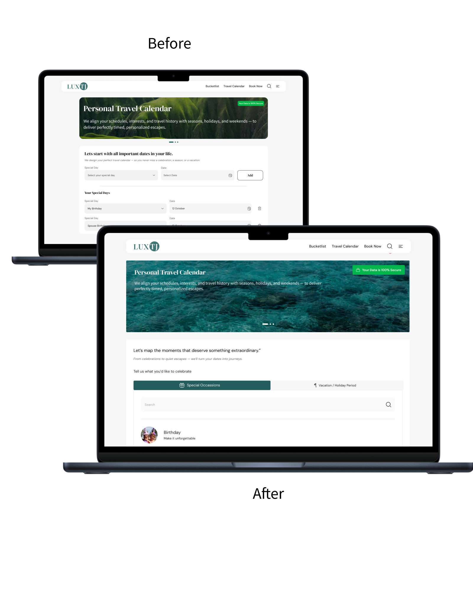
How might personal milestones become useful travel inspiration without making setup feel like administration?
The original Personal Travel Calendar opened with an unfamiliar setup flow. Before adding anything, people spent about two minutes working out what the feature was for, which dates belonged there and what would happen next.
I studied progressive disclosure, demonstration-led onboarding and familiar calendar patterns. People were being asked to organise information before seeing how a birthday, anniversary or meaningful moment could become a travel plan.
I introduced the feature through recognisable personal moments, showed the travel-planning benefit first and created one clear path for adding a date. Recommendations and next steps then appeared progressively, keeping the calendar useful and lightweight.
What stayed with meShow how a personal date becomes a meaningful plan before asking people to maintain it.
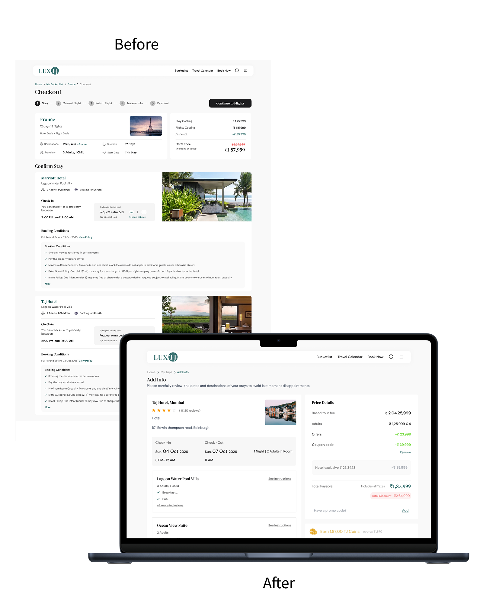
How do you keep essential trip details visible without making checkout feel endless?
The original checkout brought every decision, policy and trip detail into one long page. Users had to scan through too much information at once, contributing to a drop-off rate of nearly 60%.
I audited checkout patterns across travel platforms, comparing how they sequence travellers, itinerary details, pricing, policies and payment. The strongest examples reduced memory load without hiding consequences.
I reorganised checkout into decision-sized groups, kept the trip summary and price visible, made sections editable and moved supporting detail closer to the moment it was needed.
What changed in my practiceThe checkout improved when every detail appeared beside the decision it affected, with an obvious route back to edit it.
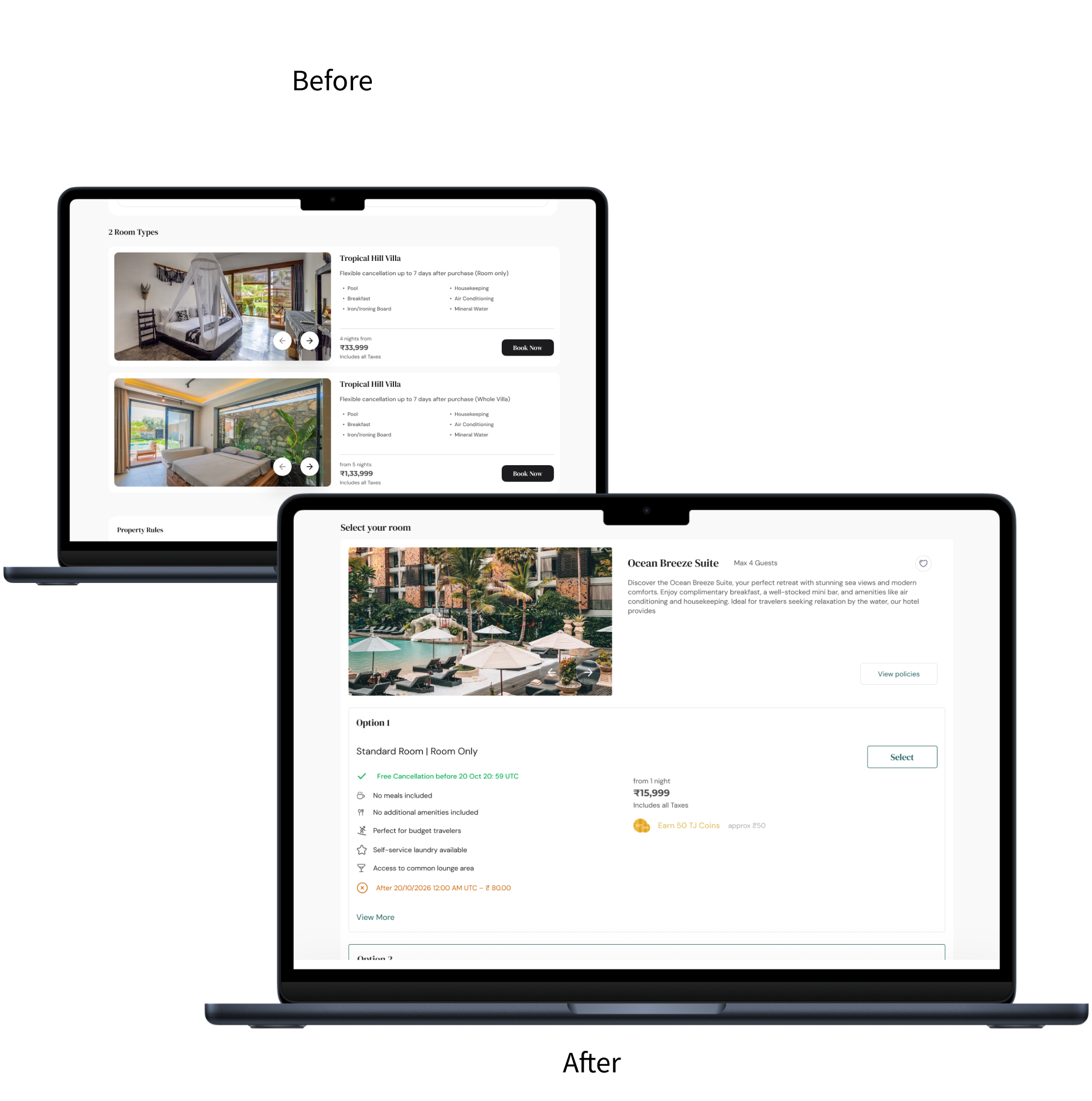
What does a traveller need to know before a hotel feels safe to choose?
Hotel selection took the longest part of the journey. Important differences were difficult to scan, forcing people to open, compare and revisit options repeatedly.
I reviewed hotel product-detail pages across travel websites and mapped the evidence people use to decide: location, inclusions, room differences, cancellation, price and the path forward.
I redesigned the description and room-selection pages around comparison. High-value evidence appears first; richer detail remains available progressively; price, policies and actions stay connected.
The detail that matteredThe hotel page was answering six questions at once. I prioritised the evidence people needed before booking and moved the supporting detail one step deeper.
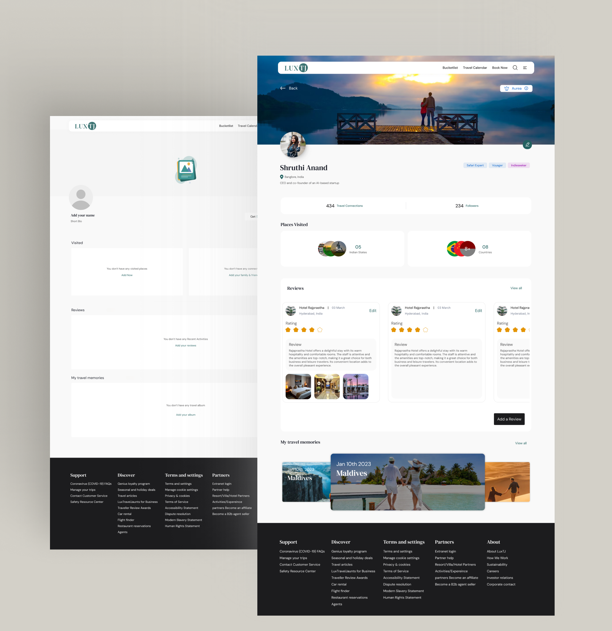
How can each profile step show enough value to earn the next one?
Profile interest was close to zero. Multiple pages and features were presented at once, with no obvious first step and no visible reason to complete them. I mapped where people stopped, then used a clearer starting point and visible progress to make the value of each step easier to see.
The trigger–action–reward restructure moved time spent in the profile up 70%, but drop-off still spikes at the second profile step. I have a theory about the amount of information requested there, but I have not tested it yet.
I took a loosely defined product idea, clarified the decisions it needed to support, studied user behaviour, mapped the journeys, set the information hierarchy and worked with developers to resolve edge cases before implementation.
Converted loosely defined travel ideas into clear user problems and measurable questions.
Combined observed friction, comparative analysis and behavioural patterns into design direction.
Redesigned core flows, page hierarchy, component behaviour, validation and recovery states.
Maintained a shared library across three platforms and worked closely with engineering through handoff.
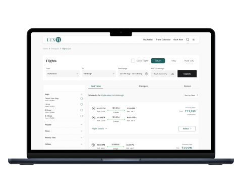 01
01Shared patterns make duration, stops and fare conditions easier to compare.
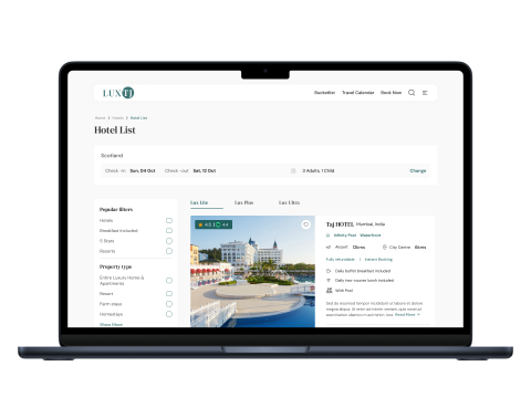 02
02Filters, map context and richer results support a confident shortlist.
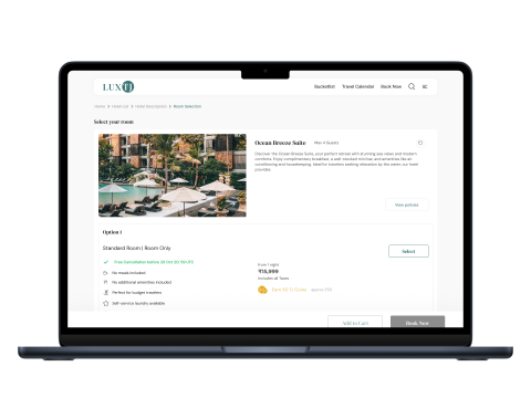 03
03Policies, inclusions, price and the next action stay connected.
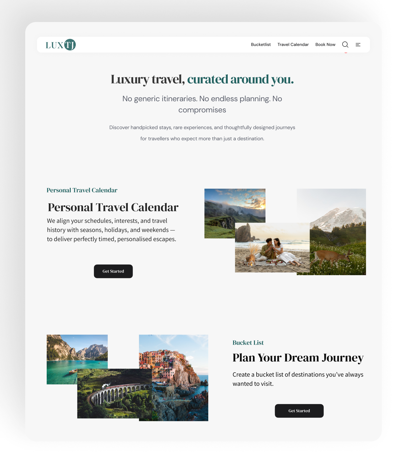 04
04A clear introduction explains the value before asking people to add information.
The same principles, including progressive disclosure, persistent context, visible consequences and clear recovery, were carried into reusable patterns across customer web, mobile and the partner extranet.
I spent the first two weeks trying to fix checkout by moving things around visually before I realised the actual problem was that nobody understood what they were paying for until the last screen.
That was a wasted fortnight, but it was also the point where I stopped treating this as a UI job. From there, the work became a question of sequencing decisions, consequences and recovery.
Heads up. These figures come from the project data available during the work. A controlled A/B test was outside the project, so I trust the direction more than the exact number.
I can walk through the failed directions, research choices, alternatives and delivery decisions in a portfolio conversation.