Safety
Urgent warning signs interrupt the routine flow and preserve access to human-led care.

An evidence-informed care-navigation concept for people in Scotland, designed to reduce uncertainty before, during and after contact with human-led healthcare.
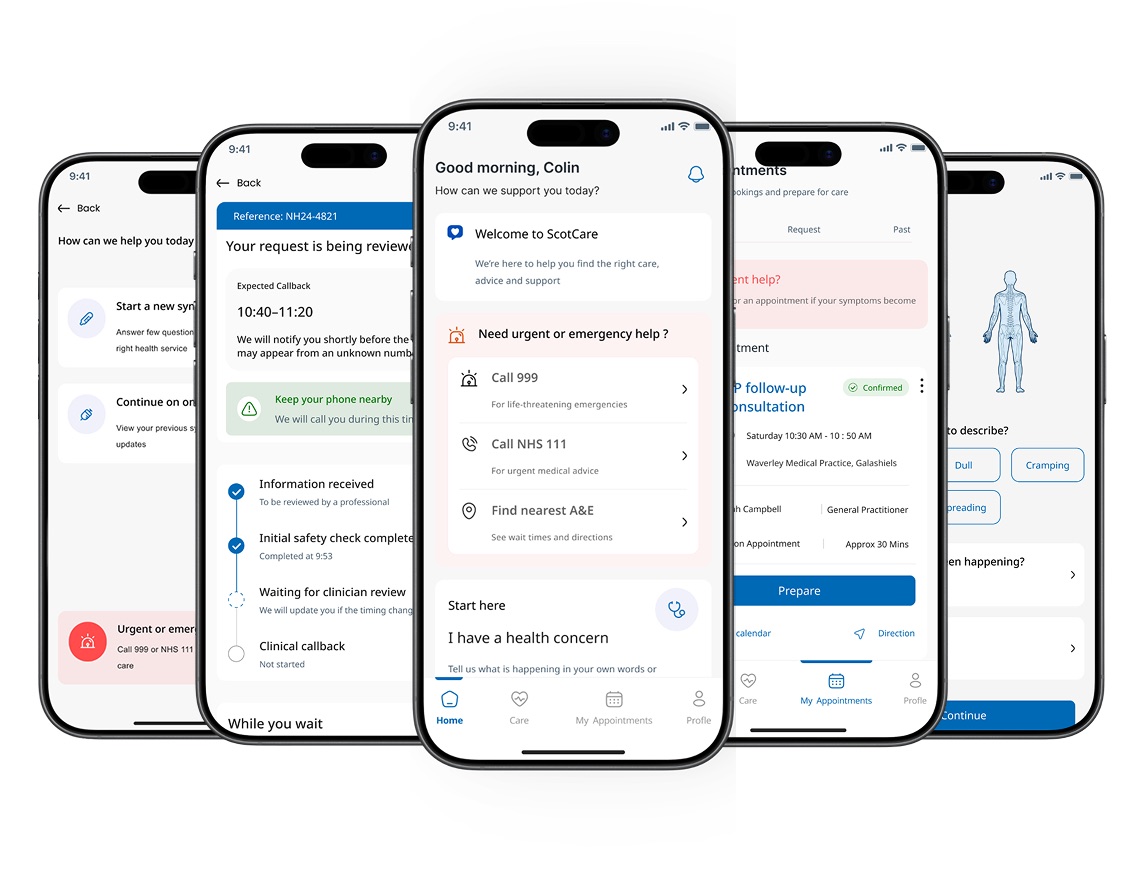
ScotCare helps a patient describe a concern, recognise when urgent help may be required, understand a suggested care route and stay supported while waiting, preparing and following up.
Urgent warning signs interrupt the routine flow and preserve access to human-led care.
The interface explains what it understood, why a route is suggested and what happens next.
Waiting, preparation, follow-up and recovery remain part of the same journey.
Important: ScotCare is an independent academic concept with no affiliation to NHS Scotland. It offers no diagnosis or prescription and has no clinical validation.
When someone feels unwell, they may need to choose between a GP, community pharmacy, NHS 24, A&E, 999 or self-care. The challenge is not simply finding services; it is translating information into a confident, timely action while anxious or in pain.
Research questionHow might an AI-supported care-navigation service reduce uncertainty while maintaining safety and continuity before and after appointments?
The project moved away from an unsafe “all-in-one NHS app” idea towards a constrained navigation and communication layer that preserves human clinical judgement.
Published evidence on digital triage, safety-netting, patient communication and appointment preparation.
Recurring breakdowns became experience principles and explicit design requirements.
Three provisional scenarios explored urgent, uncertain and lower-risk care situations.
Journey maps, information architecture and low-to-high fidelity prototypes connected the service.
Scenario walkthroughs, heuristic checks, accessibility review and formative industry feedback.
Each stage keeps the route, reason and next action visible while care moves between digital guidance and people.
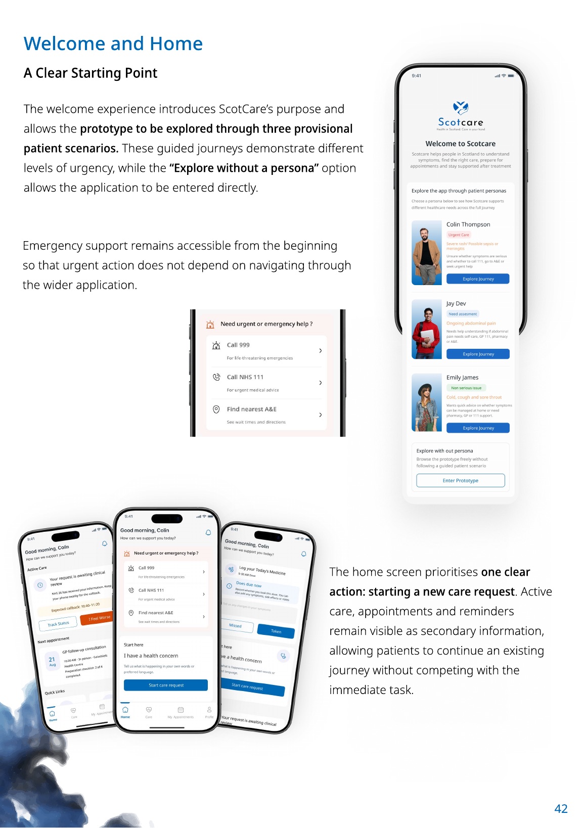
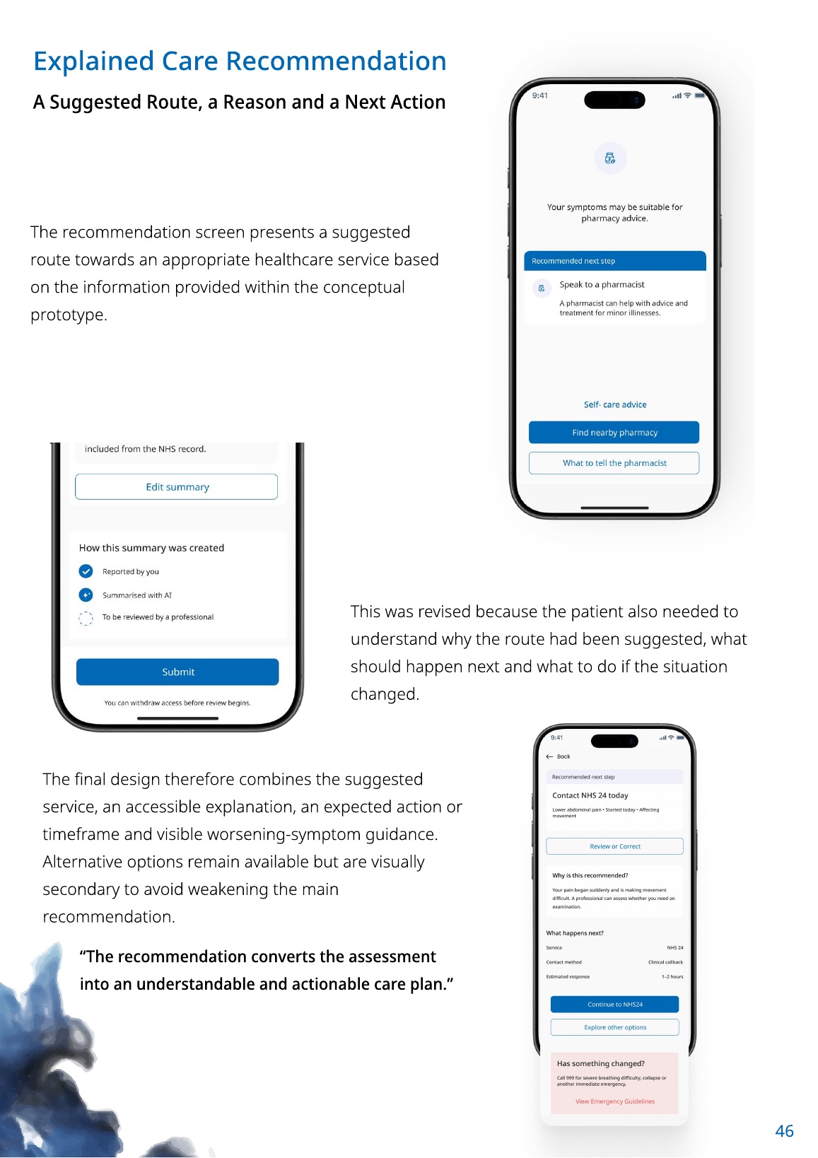
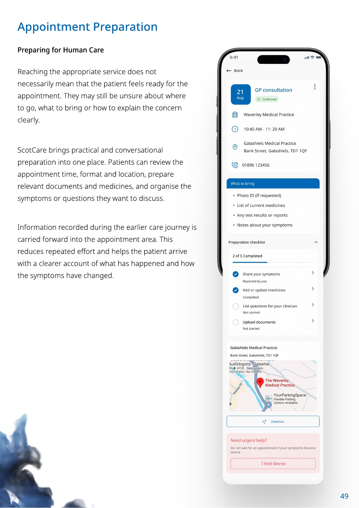
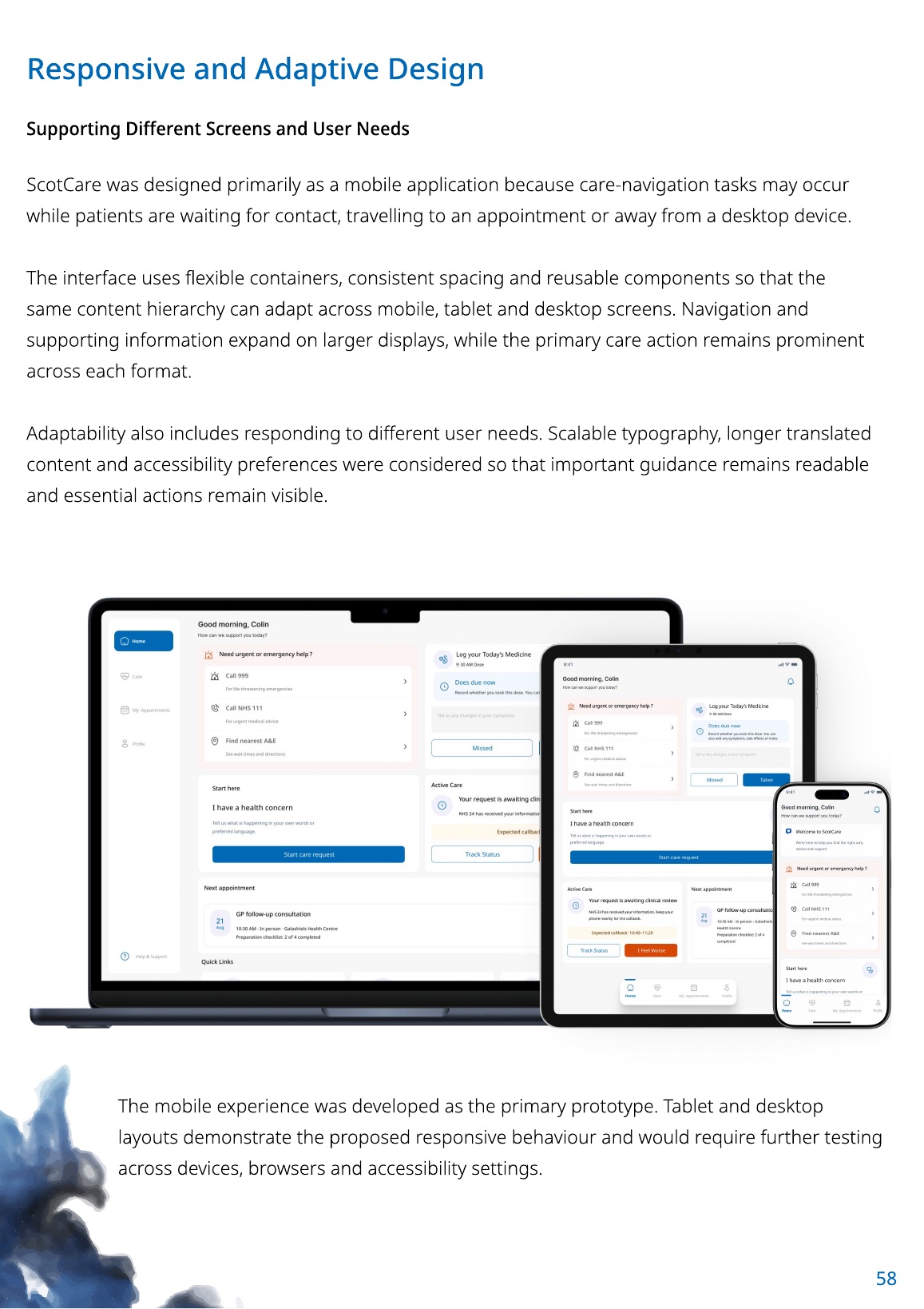
Mobile remained the primary format. Tablet and desktop adapt the same content hierarchy through flexible containers and reusable components, while urgent and primary actions remain prominent.
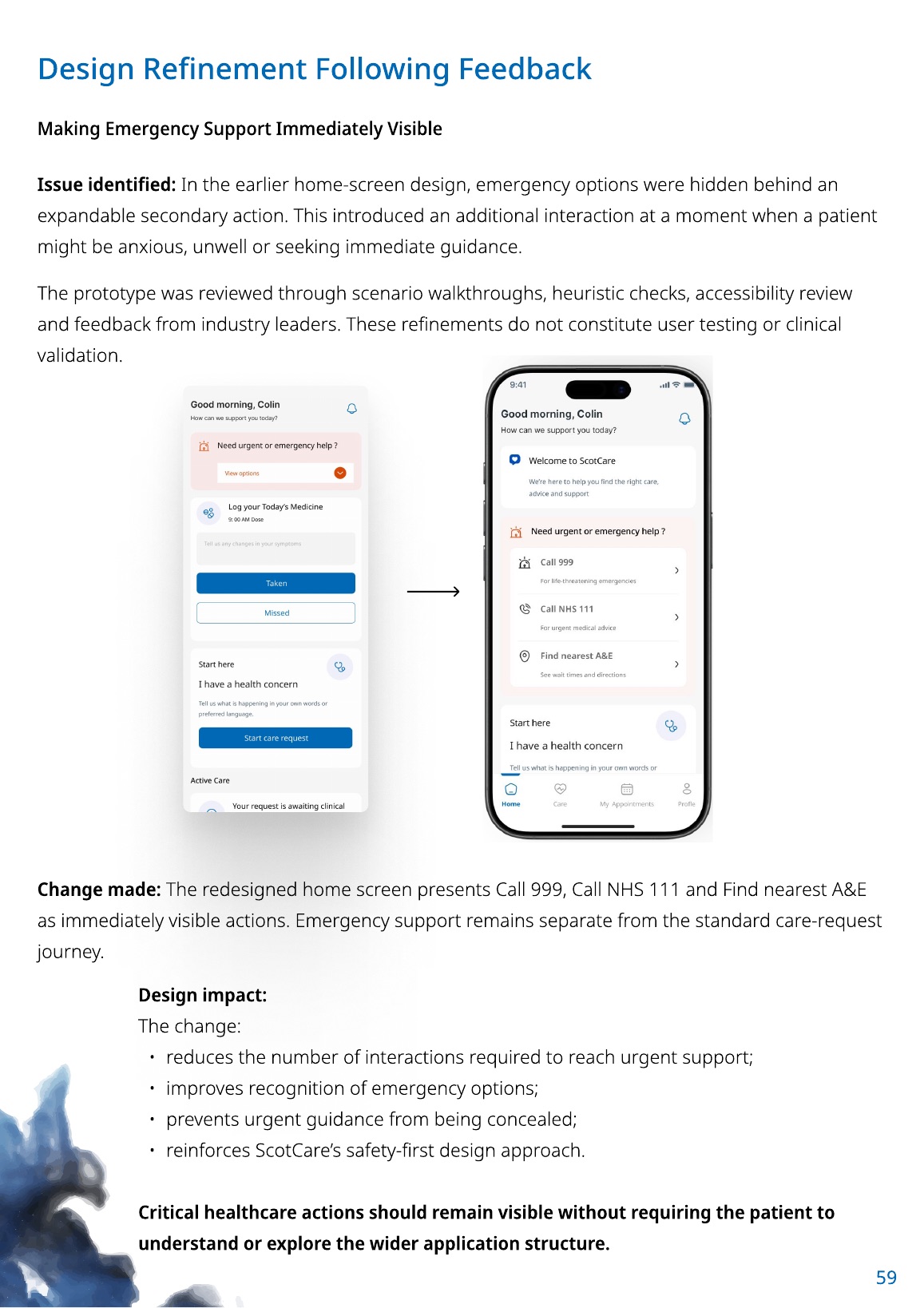
An earlier home screen hid urgent options inside an expandable card. The revised design keeps 999, NHS 24 and A&E guidance directly visible, because reducing density was not worth adding friction before safety-critical information.
The project was evaluated through secondary research, scenario walkthroughs, heuristic and accessibility checks, plus limited formative industry feedback. It did not include patient or healthcare-professional recruitment, participant usability testing or clinical validation.
The complete design project and critical report document the evidence, decisions, limitations and final prototype in depth.